SPL Usability Report
- Gavin Navarro
- Apr 20, 2025
- 13 min read

Updated: Nov 12, 2025

The Scottsdale Public Library (SPL) system is located in Scottsdale, Arizona. With four branches located from north to south, this library system serves a great number of diverse communities. It is essential that the library's website is undergoes usability testing to ensure it can not only continue to serve its patrons, but to also make room for new services and programs to come as the library experience more growth in the wake of the COVID-19 pandemic.
Internal stakeholders at SPL have identified the following issues for usability testing:
Accessibility [Go to section]

Is the website user-friendly for users with low-vision or other accessibility requirements?
Navigation [Go to section]

Is the website's information architecture intuitive for users?
Language Use [Go to section]

Is the language being used user-centered? What terminology being used is easy for users to understand within reason?
Sustainability & Growth [Go to section]

What sustainable changes can be implemented to make web upkeep easier in the future?
Identifying Users
Understanding what it is that SPL's users need is important when considering a website redesign. That begins with identifying SPL's actual user base. Who might these users be? What do they come to the library's website looking for and what challenges might they face in the process?
SPL has identified the following as well-served user groups and underserved user groups of the SPL website:
Well-Served Users
Physical Space Users
These users frequent the library in search of a space to work or study. They often reserve study rooms or take a table to spread out at. Often times, they keep to themselves, occasionally asking for assistance.
D.I.My or "Do It Myself" Users
These users know how to place requests online and do so often. They are aware of the rules of Interlibrary Loans (ILLs) and the MAX program, having used them before. They know that the latest James Patterson is getting published in March and that early February, they’ll be able to get on the waitlist. This user group is relatively self-sufficient.
Digital Content Users
These users are often introduced to the library by word of mouth, having heard about the benefits of saving money by checking out eBooks or eAudiobooks. They want to know what apps the library offers and how to get started as soon as possible.
Caregiver of Children Users
These users are parents, guardians, nannies, or grandparents. They often bring their children to Youth programs, such as weekly storytimes or STEM programs, and hop between libraries to do so. They are somewhat familiar with the library’s policies, especially if they have a library card. They sometimes request help with specific book topics, such as losing a pet, “my neighbor has 2 mommies”, and the occasional book report.
Underserved Users
Technologically Inept Users
These users often come to the library, call the Library Helpline, or submit Ask-a-Librarian forms requesting assistance for technology related tasks. Frequent tasks include requesting holds, downloading eResources (eBooks, eAudiobooks, Digital Newspapers, or eMagazines), and reserving study rooms. These users are considered underserved because they lack the ability or knowledge to complete these tasks on their own.
Young Adults (18-30)
These users primarily use the library’s website to reserve study rooms or find contact information to call and inquire about downloadable content. There is little known as to why this user group does not user the library website more often.
Non-Native English Speakers
The library website only has a translation option for Spanish, yet this does not fully function properly. These users might come to the library website in search of books or programs in their native language.
Visually Impaired Users
These users often come to the library’s website to locate information on programs or downloadable services, request holds or even register for or renew a library card. Often, they will resolve to calling the Library Helpline number to ask their questions over the phone rather than having to find the information on the website.
Accessibility
Usability Testing Method

The WAVE tool is a web accessibility evaluation tool created by WebAIM. WAVE evaluates a website's accessibility with reference to Web Content Accessibility Guidelines (WCAG) and identifies errors that are not in compliance with WCAG standards.
Three major errors were identified with SPL's website using WAVE.
Low Color Contrast
WCAG AA standards for color contrast are 4.5:1 for normal text. The color contrast ratio for large text is 3:1 (large text is defined as at least 18 point or 14 point and bold).
The color green (HEX #54A992) is used on all pages throughout the site primarily for buttons or header backgrounds.

The background color of the site is white and the font used for the text inside the box is white (HEX #FFFFFF). This shade when paired with white font has a contrast ratio of 2.81:1. This does not meet the minimum contrast ratio noted in WCAG guidelines.
The shade of red used for alerts on the home page (HEX #E74B3C) has a color contrast ratio of 3.83:1.

This ratio is not in compliance with WCAG standards and must be changed. This is particularly important, considering this red is used to deliver important information to users. If users with low visibility cannot read the text, they are unable to discern this information being shared.
Adequate color contrast is necessary for all users and, most importantly, users with low vision. Low color contrast causes strain on eyes and creates a visually unappealing experience. This means that users are likely to spend no more time than strictly necessary on a website.
The following colors are recommended with reference to the City of Scottsdale Brand Resource Guide:

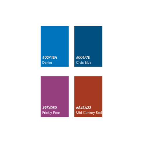


The palette on the left is approved as background colors with white font (HEX #FFFFFF). The palette on the right is approved as background colors with black font (HEX #000000).
Alternate Text Redundancy
Alternate text is essential for users who rely on screen readers to navigate the web. Alt text provides a description of an image. However, when images contain alternate text that contains the exact same wording as nearby or adjacent text, the word or phrase will be presented multiple times to screen readers. This repetition can cause confusion or plain annoyance for users who rely on screen readers to access the website. For example, it wastes a user’s time to hear the word “Kanopy” repeated five times, especially if the user is not searching for Kanopy. A simple fix to this issue is to insert empty/null alternate text directly into the HTML of the site.
The code should look like this:
<img src="image.jpg" alt="" />
This way, users can avoid annoying repetition and spend less time seeking the information they are looking for.
Redundant Title Text
The title text attribute in HTML coding is used to provide additional advisory information on a link. When users hover over the link, a small description appears describing the link. Consider the image below and how the text appears below the mouse once it hovers over the Culture Pass image.

Advisory information should never be identical or similar to the text it is describing. While this text is not identical or too similar to the text it describes, title text is typically inaccessible to keyboard users and is, therefore, not considered an accessible attribute. Additionally, it is repetitive for users of screen readers. Altogether, this redundant text should be removed from code and avoided at all costs.
Navigation
The navigation bar of the Scottsdale Public Library website consists of 9 primary links, 8 of which are dropdown links. In total, including these primary links, the navigation contains 72 links. Some of the secondary links are duplicates or triplicates (i.e.- Books, Books, and Books) listed under different primary dropdowns.
Usability Testing Methods
1) Task-Based Observations
A task-based observation was conducted to test the SPL website's usability. Three participants were identified. A script was written to ensure that participants were exposed to the same information. Three tasks, or Scenarios, were created that mimic three of the most frequent tasks SPL website users come to the site to complete. Ideal Pathways were created for each scenario to demonstrate the quickest way (utilizing the least amount of clicks) to accomplish these tasks using the website's navigation bar. Once the script was read, participants were given three scenarios and asked to perform a task. The scenarios and results are listed below.
Scenario 1: You have an interview for a job via Zoom and need a private room where you can attend your interview in peace. How would you find this information on the library's website?
Ideal Pathway: Click on "Services" in the universal navigation. Click on "Study Rooms." Scroll down and click "Reserve" for one of the study rooms.
Participant 1
Taken Pathway:
Services > Meeting Rooms > Room Reservation at the Library
Pass/Fail: Fail
Participant 2
Taken Pathway:
Services > Meeting Rooms > Room Reservation at the Library
Pass/Fail: Fail
Participant 3
Taken Pathway:
Services > Meeting Rooms > Room Reservation at the Library
Pass/Fail: Fail
Scenario 2: You are a new parent who would like to take your baby to a storytime at the library. You try calling the Library Helpline phone number, but the recording states that the Helpline is currently unavailable. How would you search for this information on the library's website on your own?
Ideal Pathway: Click on "Youth" in the universal navigation. Click on "Events." Type "Storytime" in the search bar.
Participant 1
Taken Pathway:
Youth > Events > Located storytimes in calendar
Pass/Fail: Pass
Participant 2
Taken Pathway:
Youth > Events > Located storytimes in calendar
Pass/Fail: Pass
Participant 3
Taken Pathway:
Attempt 1: Events > Calendar of Events
Attempt 2: Searched "storytime" in Catalog search
Pass/Fail: Fail
Scenario 3: You are a senior who is hard of hearing. Your friends at Bunco last week told you that you can get eBooks with large print on your cell phone from the library. How would you search for this information on the library's website?
Ideal Pathway: Click on "Browse" on the universal navigation. Click on "Downloadables." Identify an app that offers eBooks. Click on "Learn more."
Participant 1
Taken Pathway:
Home > Digital Library > Located eBooks Information
Pass/Fail: Pass
Participant 2
Taken Pathway:
Home > Digital Library > Located eBooks Information
Pass/Fail: Pass
Participant 3
Taken Pathway:
Home > Digital Library > Located eBooks Information
Pass/Fail: Pass
2) Card Sorting
Each link from the universal navigation bar was written down on an index card. A script was created to provide the same amount of information to users and reduce the potential exposure of bias from the researcher. A short list of post-testing questions were created to encourage participants to speak about their completed card sorts and to consider potential alternatives to their final sorts.
A card sorting usability test was conducted. A list of prospective participants were screened. The screening included a series of questions that asked participants about their experience with library websites, professional history, age, sex and more. The purpose of these questions were to discern whether participants selected represented actual users, and, therefore, user groups, of the library’s website. Professional history in particular was essential in screening participants as a participant’s knowledge of language used in library and information settings might skew usability testing results. This would result in data that does not represent the majority of the library’s user group.
Three participants were selected. These participants were read a script, asked to perform a card sort, and answered the short list of survey questions at the end of the usability test.
Data:
Participant’s names have been redacted or reduced to initials for participants' privacy.


Participants were asked the following questions at the end of their card sorting activity:
How did you feel during the activity?
At any point throughout the session did you feel challenged?
Were there any cards that were difficult to place?
What other categories or groupings would you have considered, if any?
Usability Testing Methods Evaluation
The data gathered from each participant’s card sort and survey discussion was analyzed. Using this data, a final card sort, titled Proposed Sort below, was created. The Proposed Sort is a restructuring of the library website’s information architecture. It represents a user-friendly and intuitive design, with information categorized by the Scottsdale Public Library website's actual user base.

In combining the insights gathered from task-based observations and card sorting usability tests, a wireframe was created. The wireframe, titled Proposed Wireframe, is a visual representation of the changes recommended and informed by the insights from real SPL website users during usability testing.

Recommendations
Primary Links
All participants altered the title of at least one primary link in their card sorting results. This, in addition to feedback during the survey questions, indicates a need for more intuitive language in the universal navigation. The following recommendations are primarily driven by the need for language changes, as well as the opportunity for website growth.
At the Library: Similar to “Browse”, this title reflects the physical materials, events, and services users can find at each Scottsdale Public Library branch.
Locations & Hours: Now a dropdown menu. All secondary links are branch-specific (e.g.- Pony Express Self-Service is exclusively offered at Appaloosa Library).
Ask Us: One participant titled this “Librarian Help.” This is separate from Contact Us, as secondary links here are related to policies or services rather than general contact information.
Support the Library: Some secondary links from “More Info” were recategorized her during usability testing. The language change is more intuitive and open-ended.
Secondary Links
At the Library:
Calendar of Events: previously Online Calendar > name changed. Previous .pdf link removed.
Rental Meeting Rooms: previously Meeting Rooms > name changed. Users were frequently confused and did not know the difference between study rooms and meeting rooms.
Shop @ the Library: previously Shop at the Library > name changed to reflect consistency.
Services:
Readers Advisory: Reconsider grouping Bookmates and Books2Go into a single page about Readers Advisory. If must be separated, consider more intuitive language (i.e.- Bookmates: Readers Advisory)
Library Card:
Digital Library: previously Downloadables > name changed to reflect similar language use on home page. New title is more intuitive.
Your Savings: previously Library Calculator > name changed. Previous title was confusing. This is a complex link to describe easily, so the aim is to pique interest with a more engaging title.
Locations & Hours:
The Gallery @ Civic Center: Previously The Gallery @ the Library > name changed to reflect accuracy. Listed under Locations & Hours because it is location-specific.
Pony Express Self-Service: Previously Pony Express > name changed to reflect more intuitive language.
Additional Changes
All secondary links to Social Media (Facebook, X, Goodreads, Instagram, YouTube) removed from navigation bar. It is a conventional for external linking to Social Media to be located in a website’s footer.
All duplicate/triplicate links have been removed (Events, Books, Suggest a Program, and Suggest a Purchase). While it can be beneficial to include a link to the same page under multiple Primary Links, it is also redundant. Users can be left questioning the difference to these same secondary links being located in multiple places, causing unnecessary confusion.
Language Use
User-friendly language can be directly linked to a users likelihood of successfully accomplishing the task that brings them to the library's website. SPL's website contains inconsistencies in its language. Throughout the site, language used indicates that the website or certain pages were written for librarians and/or staff.
For example, use of the word “patron(s)” can be found on multiple pages (Pony Express, Library Policies, Interlibrary Loan, Study Rooms, and more. All instances of use can be located by searching "Patron" using the Website Search function). The only pages that dictate such formal language use are those directly related to the Library's Policy Manual and Administrative Regulations (A.R.'s).
Use of such jargon, or library language, is not encouraged as it can cause confusion for many users who may not know what the language means. It is more effective to substitute the word "patron" with “you” or “person,” depending on the context. Conversational language does not take away from the professionalism of the site in this case.
Sustainability & Growth
As the Scottsdale Public Library system continues to grow, so too do the communities it serves. This growth is often reflected in the evolution of services provided and the expansion of the collection offered. As the library's services adapt and the collection swells, it is essential to update the library's website to reflect the most accurate information to date. Creating a sustainable website, or a site that is easy for staff to maintain, is essential. Additionally, ensuring that the website has space for new services and information that may come in the future is equally important.
The recommendations made in each section of this report are rooted in sustainability and growth. Best practices for usability indicate that iteration is key. While I.T. or library staff responsible for making changes to the website may find it vexatious at first, it is crucial that Scottsdale Public Library makes it a habit to update the website iteratively. This is can be achievable by doing the following.
For Accessibility, run every page through the WAVE tool prior to publishing. This will catch any issues within the HTML or CSS, or the coding, of the site. Text size, color contrast, and alt text are relatively quick fixes when caught quickly. Updates for these things tend not to go noticed by users quickly and can be done swiftly to prevent any further harm to users.
For Navigation, making multiple changes at the same time can confuse users who are used to the current layout. Once decisions have been made on what changes to make, a list of priorities should be made. This list should contain the most impactful changes at the top and the least impactful changes at the bottom. Most impactful changes might include changing the name of a dropdown section / frequently used link, or a dropdown menu that functions completely differently. Least impactful changes might include a name change to a link that is not frequently visited or the combination of two pages of the sort. By updating the website with those most impactful changes altogether, users will be confused but have a opportunity to adjust to the change and ask for guidance. Following this initial, big update, the items on the bottom of the list can be updated as time goes on.
For Language Use, guidelines should be created for purpose of writing copy. This can take the form of do's and don'ts, or simply provide a list of Instead Of's. A list of Instead Of's would include words or phrases that are user-friendly and substitute language used that is likely to hinder a user's ability to accomplish a task. If a user has to think about what a word means, perhaps the word should be changed. Additionally, naming a specific service can be fun. After all, who doesn't love a catchy or witty name? The answer is users. Users are unlikely to take the time to read about why a service is called something, nor do they care. This act is usually done for library staff and what good does it do when it just becomes a fun fact that users never ask about. Being selective with language use and prioritizing the user's perspective is key.
Increasing sustainability means undoing someone's hard work, rebuilding it, or sometimes scrapping it altogether. However, making these habits will increase sustainability for SPL's website in the long run and will grow easier with time. The sooner action is taken, the sooner it will pay off.
References
WebAIM (2025). WAVE web accessibility evaluation tools. Utah State University.
WebAIM (2025). Contrast checker. Utah State University.
Comments